What this blog already did for my project
By creating this blog and showing the world what i’m doing. I was forced to think about what I want with my project, and explain to others whats going on in my head.
1.Looking back at my process.
For the update post I had to look back at my offline logbook and translate it to English. [if you wonder why my blog is in English, because I’m doing it for and with the internet] I realized that my first goal wasn’t a system (as I now like to call my project) but a co created project with the internet, where I would be the (art)director and the internet the content creators. Somewhere along the way, I decided that I wanted to create an algorithm that would directed the data input from the crowd and turn it into an image (and a title). And that’s also a cool idea but it’s not the idea where I started with.

2.Seeing what I already have done.
These last couple of weeks felt a bit slow for the process. I felt a bit down and had the feeling my project was going nowhere. Or at least not the place where I and other people expected it to go. But writing down update and seeing what steps I only made this week, reading books and actually putting something online for the internet to see (my co creators) gave me a good vibe and I’m feeling back on the happy track for my project 🙂
3.Making choices.
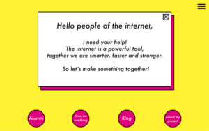
Putting something out there for everybody to see, means making decisions on how they’re going to see you and your work. What design is my website/blog going to be (yes, there is also a website in the making/under construction), is it going to be in Dutch or English, what do I want the visitors to do and so on. So for the design I chose a mix of all my (personal) design choices I made in the last four years. In the first year of the academy I mostly used magenta (pink) and the font Impact to present my own work. In the second year it stayed mostly that, but I mixed around with all the CMYK colors. At the end of the second year I switched to the Courier font in mostly black and white, and I kept on doing that till somewhere around the end of the third year where I switched to Futura Condensed Medium and started loving the yellow. And for some reason I started putting boxes around titles or a fat line underneath it. So putting all those things together, tada….
So making this blog was a good choice (so far)! Now I hope that I will keep loving it, and will keep writing 😉